"September" Devlog. Ideally this would go up nearer the end of September than the middle of October. SEPTOBER IT IS. I was supposed to buckle down and work on JARPUG's level editor. And I did!
But my game design and development workflow changed. My todo list got fat.
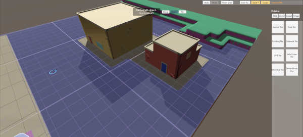
OH NO I CHANGED THE CAMERA.
JARPUG's last demo had a free-moving camera that would slowly scoot along after the pug, teleporting to catch up if it got too far behind. I let players adjust the camera's pug-distance at will. None of the hundred-or-so testers reported discomfort. Yay!
But I noticed that moving sideways led to players spinning around and getting disoriented, especially if the camera had to teleport to catch up. Also, the demo level was relatively small and didn't have cause for backtracking. After testing backtracking out myself, I decided that getting dragged sideways and running a tiny pug through my own head repeatedly wasn't a great way to explore an RPG world.
Lazy Camera, Comfortable Player:
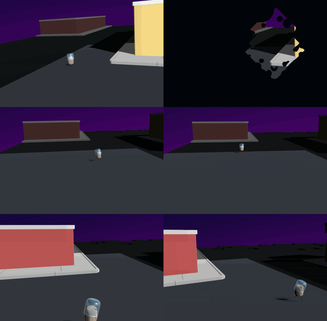
JARPUG's new camera is kind of similar to top-down 2D games. The world is now separated into 8x8 tile chunks with fairly obvious lines between them. The camera stays centered on the current chunk, rather than rubber-banding after the player character. The camera teleports to look at the center of the next chunk immediately once the player gets "far enough" into it. 2D JRPGs often did a fast "swipe" animation for this sort of transition.
That approach is a little too vomit friendly in VR, so I have a highlight that gradually fades out on the previous chunk, helping show where you came from.
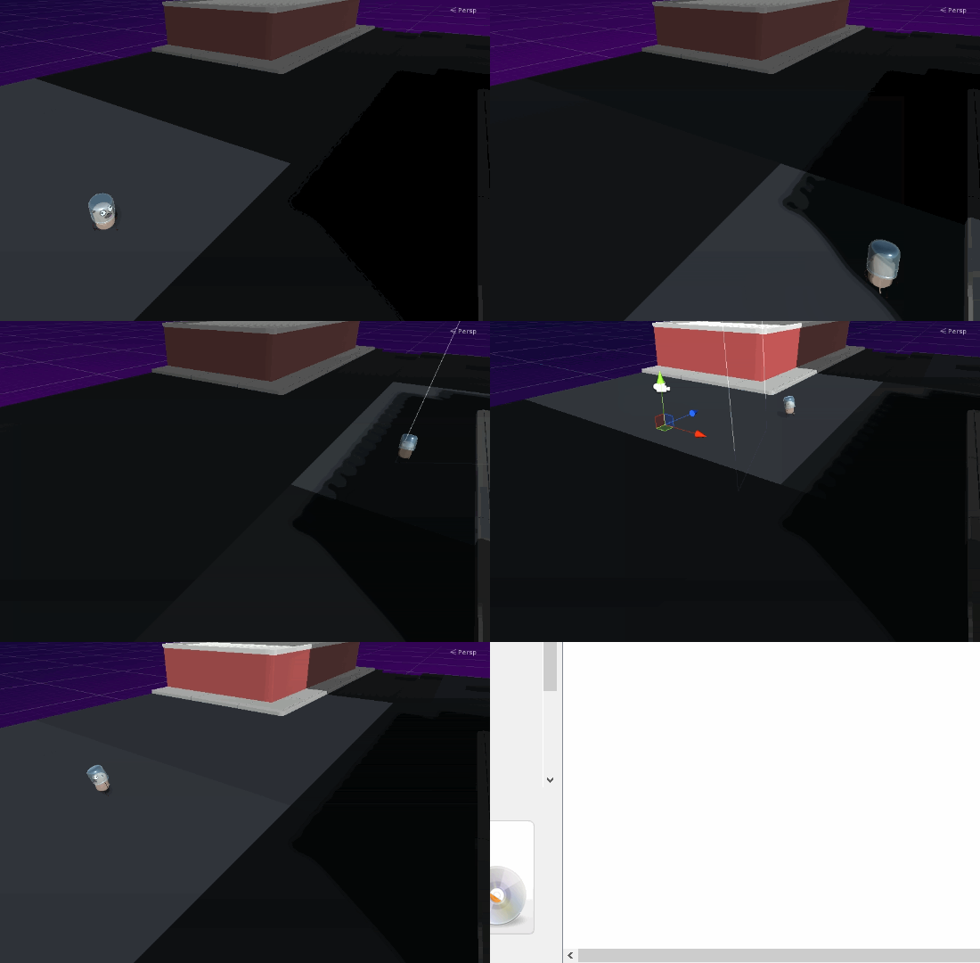
The chief hope behind this camera design is that small, explicit level chunks will let players explore without reorienting themselves constantly, especially since they'll know when to expect the camera to move thanks to the obvious boundaries. An RPG map is a big place and I want it to be something the player can explore in a leisurely state. Looking around a JARPUG level in VR is still cool. I just don't need to require it.
OH NO I MADE LEVELS BIG.
Previously, I wasn't sure about how large to make my levels or how to handle camera transitions. I'd been considering a "toybox" style where the player moved from level island to level island, with adjacent areas disappearing whenever you moved. That would have been garbage for exploring and remembering where anything is.
This new camera design allows for large contiguous levels, which will be far more pleasant to explore. Those larger levels also make for a simpler one-dev workflow than a bunch of interconnected island-style levels.

Performance is a concern for large levels, but merging tile meshes where possible and organizing levels into chunks I can hide at will gives me enough flexibility to keep these VR dogs running on potato processors. Hopefully.
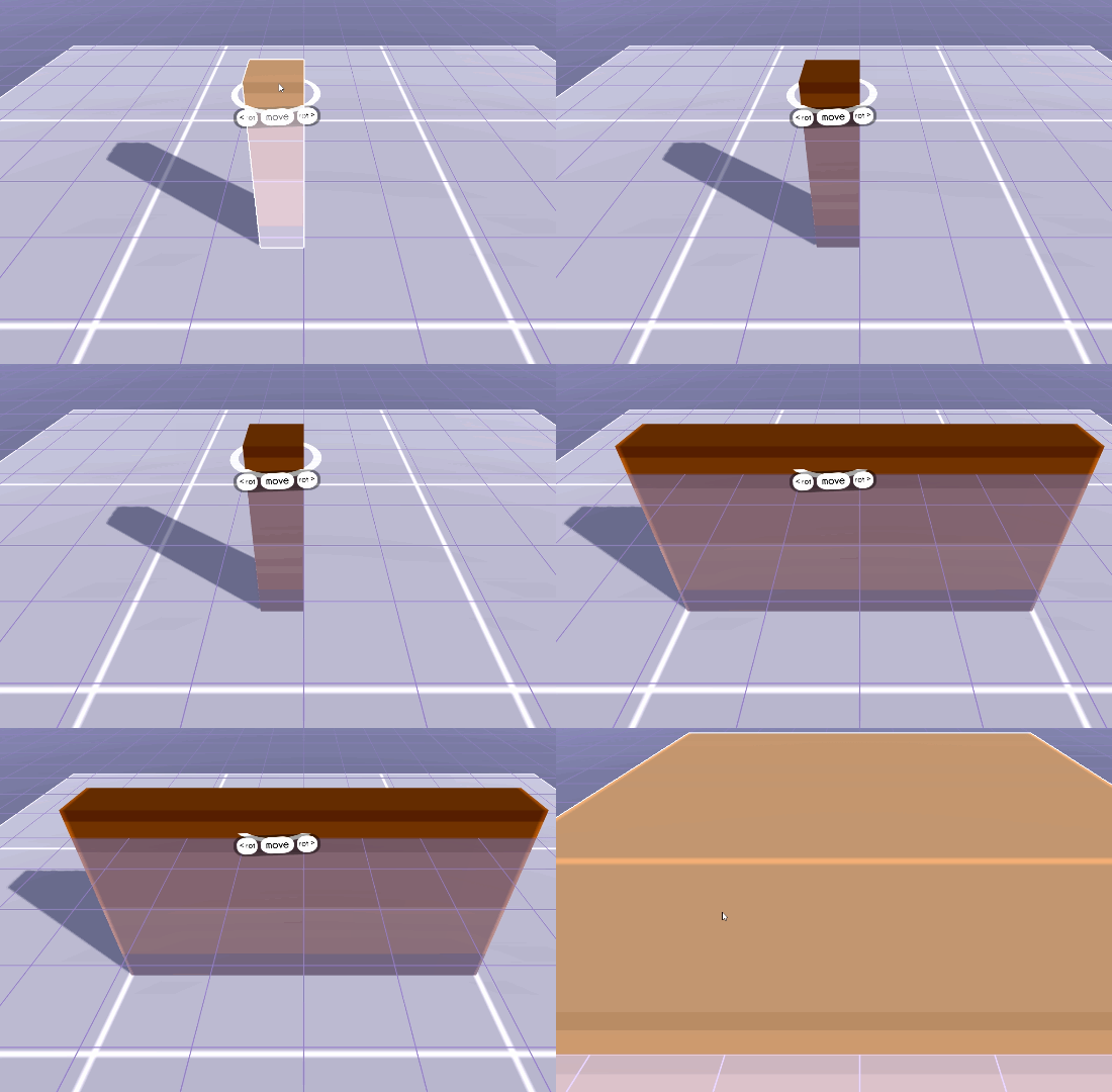
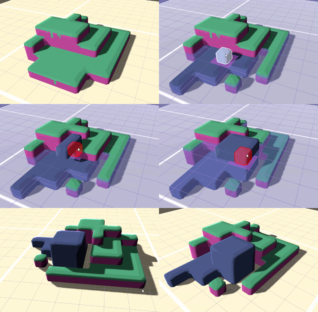
Also, I made level building blocks that can be much bigger than the current tile size. Now levels can have a beefy dirt floor without using 500 tiles.
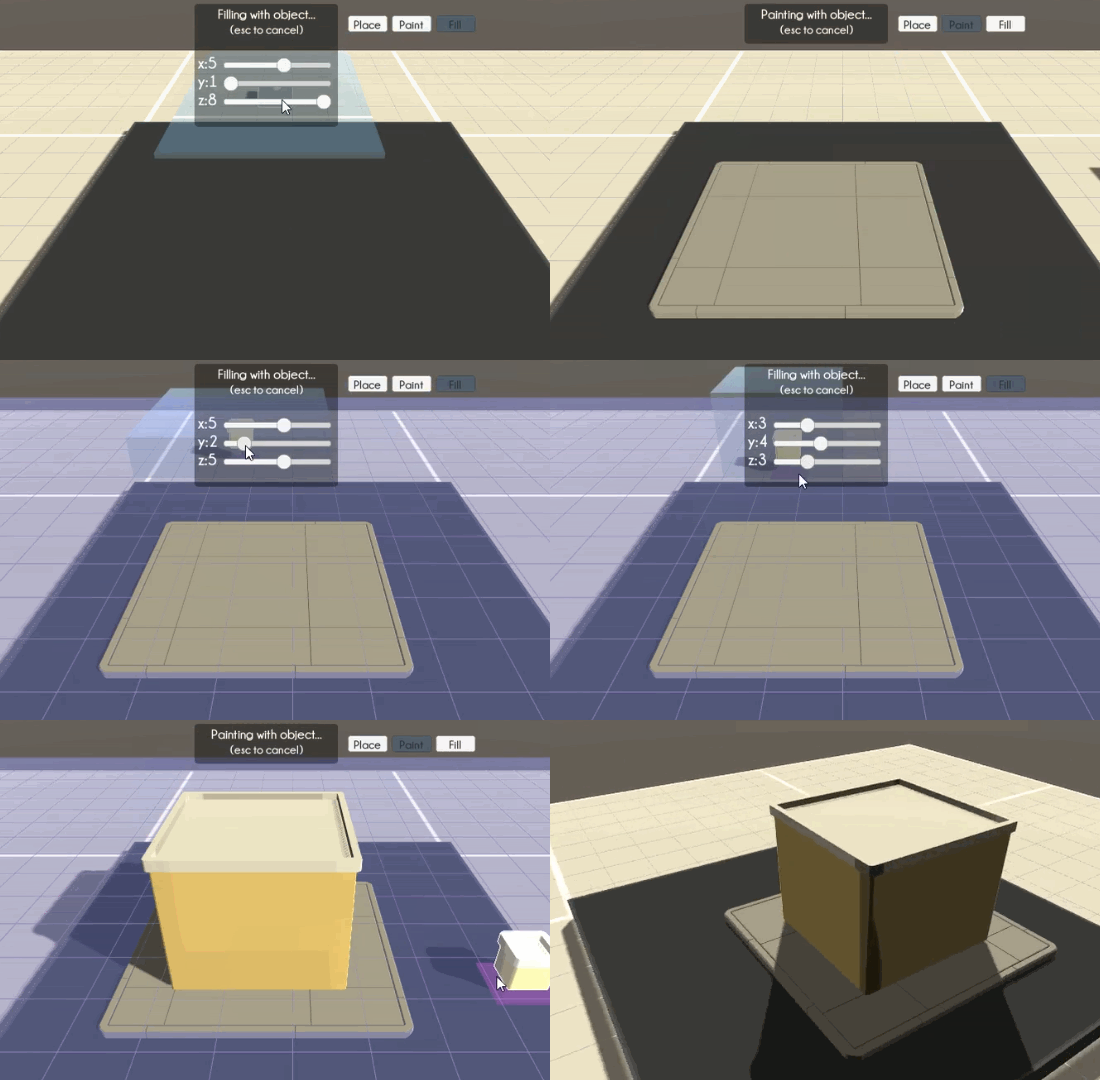
But sometimes you just need a fill tool, so I added that too.
Making it easier to make tilesets:
I originally went with a tiled level approach to speed things up. But JARPUG's tiles aren't simple cubes. They smoothly interlock with each other and can have rounded edges. Each block has four separate meshes: one per corner.

Just taking horizontal neighbors into account makes for five possible corner meshes: corners, inside corners, edges, and middles. But things get significantly more complicated when taking vertical neighbors and hard cutoffs like level edges into account. There are 16 different models for the simple building tileset, not counting decorations like bricks, doors, and windows.
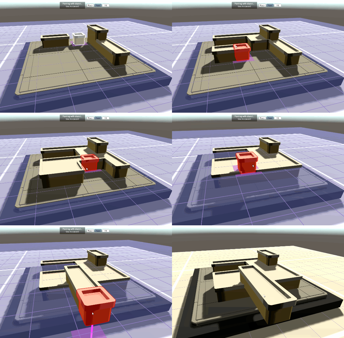
Setting up all of those tiles and their colliders so they match up perfectly takes a while. I needed to make it easier to reuse and alter these tilesets.
OH NO JARPUG HAS TEXTURES NOW.
It turns out having all of the details in the game be mesh-based led to tilesets that weren't especially flexible or reusable. Look at this stupid sidewalk:
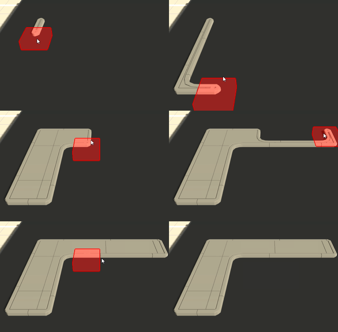
It's beautiful. And I made tiles recolorable via UV shifting this month! Now I can have red sidewalk, too. Hmm.
So I set out to make a more generic tileset that I could apply new textures to for various uses. As I'd only been using textures for color before, I had a lot of work to do. UVs had to be rotated and offset to pick the desired hunk of texture for the top and side of each tile.
These tiles are still each made of four parts, so each textured "tile" was actually shared across two meshes.
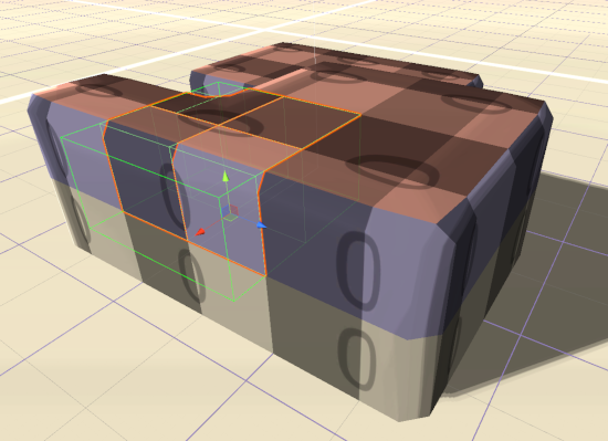
Sharing one texture for different tiles is very helpful for performance, but colors bleeding over from adjacent tiles is a big issue. I added separate configurable uv scaling values to inset each tileset's textures and combat this. The ideal inset value is always "as small as I can get away with". That can vary, depending on the side of the tile and what sort of texture is getting slapped on there.

Each tile has specific ranges of the texture they're allowed to use for their tops, edges and sides. That lets rock and grass tiles share the same material without making it too hard to pick the "right" texture in the editor.
Blah blah blah it was a pain and it works now here's a gif:
While the textures can be explicitly chosen for any tile, there's also code for randomizing the textures on placement to help get things started.
I'm sure I'll make other detailed tilesets in the future. I also plan to make more "base" tilesets for this textured style. Now I can get more mileage out of either.
This took too long to write. Bye!
